Like books, the cover for a video game because it’s often a player’s first impression of the game. Indeed, the colors chosen are important as they can show a glimpse of a game’s atmosphere. For example, intuitively, we would bet that a cover with bright colors would be a kids game, or that a dark cover would be for an horror game. Does the data confirm this theory? And what about sports games, shooters, racing games, etc., what can we learn about their coloring?
In this post, I will present how I acquired video game covers and extracted colors to transform this into actual data. Then I will quickly show some visual analysis done on them.
1. Acquiring Data
Data mining
Various websites hosting game databases offer tons of promising info to mine. I chose gamesdb.net as it had a nicely documented API capable of many things. This website also has additional info like the genre of the game, a small description, the publisher, the rating and the ESRB age rating. The most useful advantage of this website is that it has thumbnails versions of the covers – no need to download thousands of HD images.

Figure 1.1: Playstation 1 covers arranged on a 2d map using their colors with the t-SNE algorithm.
To simplify the analysis, I only acquired Playstation 1 (PS1) games as there is a great selection of games – over 2000 – and also for nostalgia reasons. Figure 1.1 shows all the downloaded covers, cropped, then arranged on a 2d map using their colors with the t-SNE algorithm. Interestingly, white covers are on the bottom of the map, black covers on the top-right and colorful covers on the top-left. For a more sparse representation of the figure in a cleaner image, click here.
Data cleaning
The box cover often has various watermarks to indicate crucial information. As it would have biased the distribution of colors, an effort was made to remove them. The most notable one is the big ![]() that appears either on the bottom or the left of the packaging.
that appears either on the bottom or the left of the packaging.
For the sake of simplification, I used an automatic script with ImageMagick that cropped 15% of the left and 18% of the bottom of the cover. Figure 1.2 shows an example of the result of this cropping, successfully removing the PlayStation name and other watermarks, but unfortunately removing parts of the actual cover too. This is how the covers from Figure 1.1 were cropped.
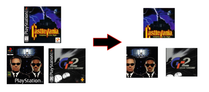
Figure 1.2: Examples of results when using the cropping script on the games Castlevania, Men In Black II and Gran Turismo 2.
Data transformation
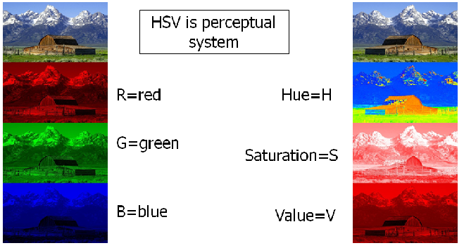
Figure 1.3 : Example of how an image can be generated from the RGB or HSV values of its pixels. (Image taken here)
The downloaded images are represented in RGB. This means that each pixel is defined by 3 values – Red, Green and Blue. Unfortunately, the RGB model is hard to interpret. To compensate, colors were transformed into a Hue, Saturation & Value model, which is closer to the human perception. Figure 1.3 shows how an image is separated into its RGB component on the left or into its HSV component on the right. The representations on the right allows to see which parts are darker, which parts have saturated colors, which parts have a certain hue, etc.
Following that, the occurrence of each color was summarized, mostly because the actual position of the pixel is not important. Figure 1.4 shows an example with the cover from the game Castlevania: Symphony of the Night (the North American version) where the pixels are separated into their RGB values and then transformed into their HSV values.
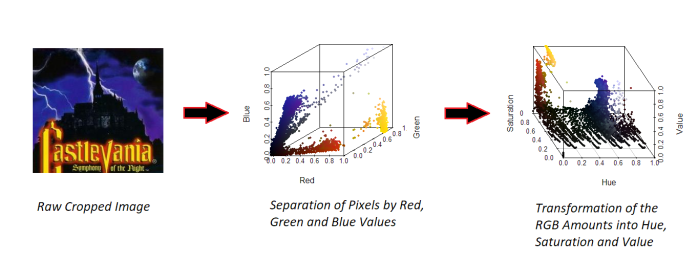
Figure 1.4: Extraction and transformation of the pixels for the Castlevania game.
2. Analysis
Example
Before doing a larger analysis by game genre, let’s see an example using only Castlevania: Symphony of the Night again.
First, the distribution for the Hue, Saturation and Value amounts were computed and aggregated. After that, a density estimator was used (Locfit package in R) to smooth the results, giving a continuous plot instead of a bar plot. Then, actual colors were sampled from the cover that are close to that amount and ordered using Hilbert curves.
The result is shown on Figure 2.1. With a quick glance, we can see that blue-purple is the most popular hue (taken from the clouds behind the castle). We can also see that both the red and yellow hues are important and make the Castlevania name really pop out. These colors stand out against the black pixel background which is omnipresent. Overall, the cover uses lots of saturated colors and lots of dark tones (low Values). Take note that pixels with low value or saturation were removed from the computation of the Hue plot.
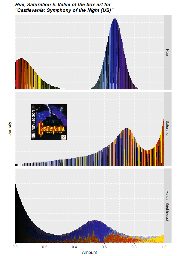
Figure 2.1: Density plot of the Hue, Saturation and Value made using sampled colors from the cover of Castlevania: Symphony of the Night.
Horror
Using a similar approach to the example just shown, we can analyze games by genre. The horror genre is the first analyzed. It includes 36 PS1 games, including the popular Silent Hill game and the first Resident Evil games. We have the intuition that horrow games would be darker. Is our intuition true?
Figure 2.2 shows HSV density plots again, but this time for all the 36 games aggregated. A black dashed line is also included to show the average for all genre. As we can see, horror games are much darker, with pixels with low Value (brightness) are much more prevalent than on average (higher than the gray dashed line for darker values). This shows that horror games are in average darker on the Playstation. Interestingly, red is more prominent than on average, maybe due to its association with aggressiveness and blood.
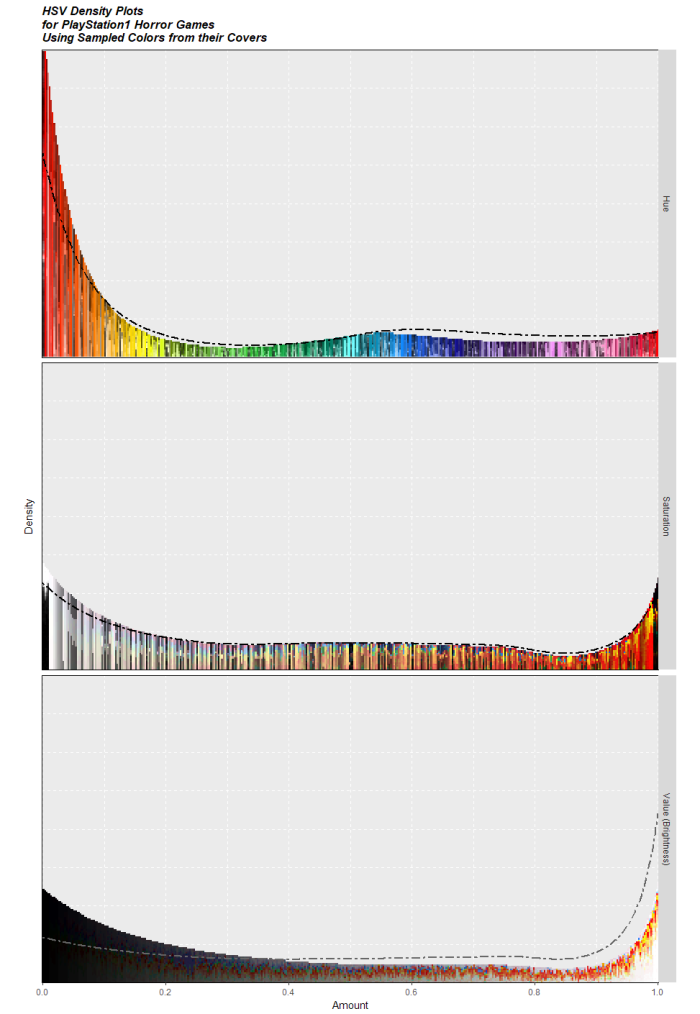
Figure 2.2: Density plot of the Hue, Saturation and Value made using sampled colors from horror games of the PlayStation 1. The dashed line shows the average for all genres.
Figure 2.3 shows again the t-SNE map, but this time with only horror games. Most of the games are in the upper right quadrant, which groups darker games together. An interesting game is Parasite Eve, shown at the low left end of the map, which exhibits a cover that goes against its genre.
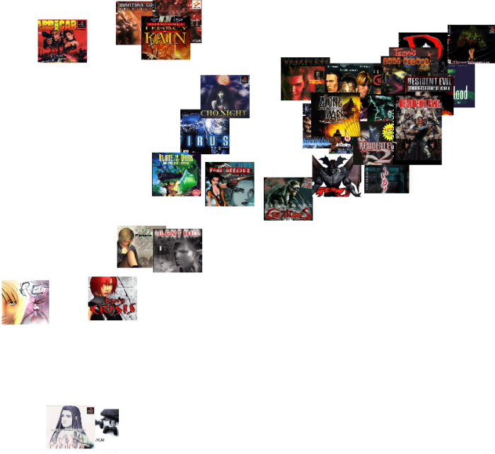
Figure 2.3: Playstation 1 horror game covers arranged on a 2d map using their colors with the t-SNE algorithm.
Platform
After the horror genre first analyzed, let’s review the platform genre. In this genre, there are 104 games, with notable series like Crash Bandicoot and Spyro the Dragon. This genre targets all ages, but most often kids. In this case, bright and colorful games would normally be more popular.
To verify this, let’s look at Figure 2.4 which shows the HSV density plots. As seen, unsaturated and dark colors are scarcer than average (lower than the dashed line). Also, the red color is less prevalent with hues a little bit more uniform.
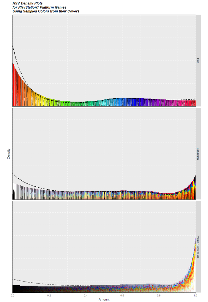
Figure 2.4: Density plot of the Hue, Saturation and Value made using sampled colors from platform games of the PlayStation 1. The dashed line shows the average for all genres.
Figure 2.5 shows the t-SNE map with platform games only. Games are spread in all possible regions, but mostly in the upper left quadrant that contains colorful games.

Figure 2.5: Playstation 1 platform game covers arranged on a 2d map using their colors with the t-SNE algorithm.
Sports
The third and final genre analyzed is the sports genre. It is very popular with 408 games in total. Many of them feature athletes and scenes from the real life.
Figure 2.2 shows HSV density plots again. As seen, whiter tones are more prevalent, because of white backgrounds and logos. Also it’s worth noting that these games show scenes from the real life and that real life isn’t as colorful as in Crash Bandicoot.
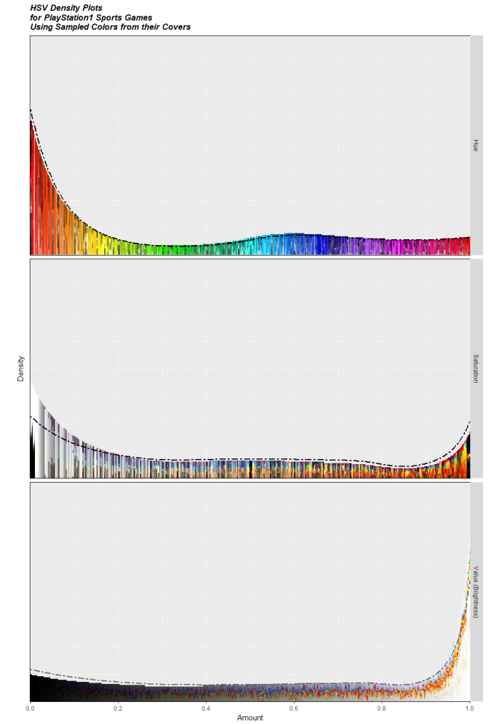
Figure 2.6: Density plot of the Hue, Saturation and Value made using sampled colors from sports games of the PlayStation 1. The dashed line shows the average for all genres.
Using the sports cover, Figure 2.7 shows the t-SNE map again. A lot of the games are stacked on the bottom of the map with their white background.

Figure 2.7: Playstation 1 sports game covers arranged on a 2d map using their colors with the t-SNE algorithm.
All genres
The three previously seen genres (horror, platform and sports) were the most interesting to analyze. For the rest of the genres, all HSV density plots (including the three genres already shown) were aggregated on the Figure 2.8. For zoomed-in images for each genre, including the t-SNE plot, please see the album on imgur.
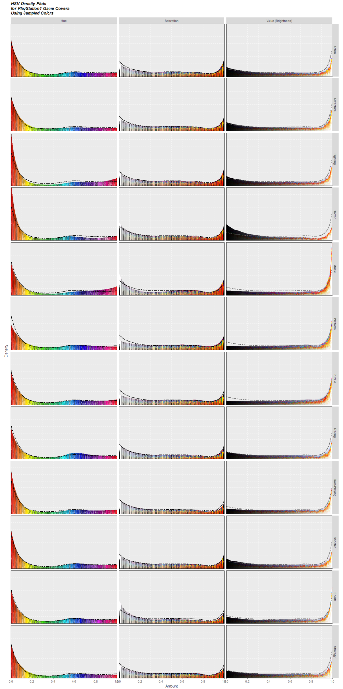
Figure 2.8: Density plot of the Hue, Saturation and Value made using sampled colors from PlayStation 1 games by genre. The dashed line shows the average for all genres.
3. Closing remarks and future works
That concludes this blog post. I only analyzed games from the first PlayStation. Would the graphs be different for newer games? Is there a notable color difference between Sony and Nintendo? Do the palette from in-game differs from the cover? These are all questions that could be examined in the future.


